Learn How to Avoid Errors Made by Data Visualization Software
Building data visualizations is easy. In fact, you can build beautiful geospatial, categorical, statistical, relational, multivariate, and time series displays with little effort, as long the data is presented in the correct format. However, it’s always important to study and review the output of your visualizations; the default settings can result in errors of omission and poor scaling.
Here are five questions to ask to avoid errors made by data visualization software:
1) Where are Alaska and Hawaii?
If you are mapping data points on a geospatial display of the United States, be sure to include all 50 states. The map below shows the location of aviation incidents and accidents[1] in the US. However, it only shows the 48 contiguous states.
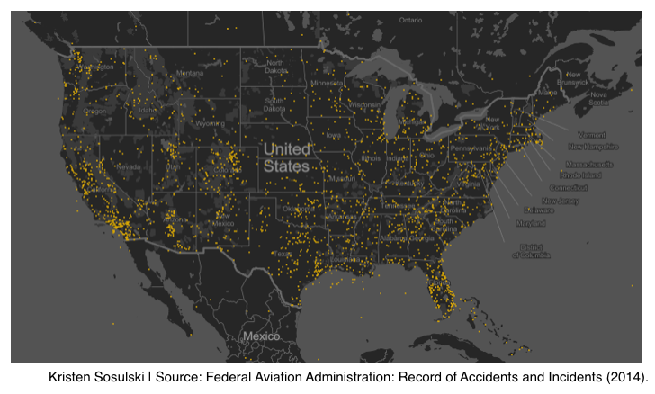
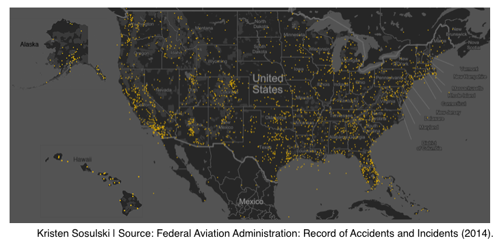
To include Alaska and Hawaii on your map, simply take screenshots of the two states from your original visualization (you may have to zoom out or pan), and paste them near the west coast of the US.
2) Why is the scale in thousands?
Are you using the correct metric abbreviations in your data visualization? In the figure below, the bars represent the number of TEUs by year in China’s ports. Take note of the y-axis.
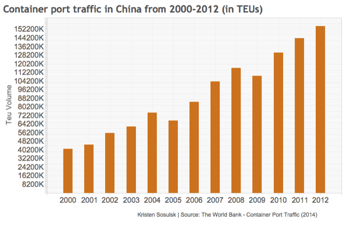
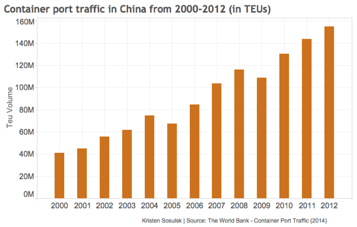
What is 40200K? It’s 40,200,000 or 40.2 million. In this case, the y-axis should be set to the highest denomination, which in this case in millions. I see this mistake often with Tableau generated charts. See the corrected chart below.
3) Who created the chart and where did the data come from?
Review the chart below. By not having a reference to the data source, it impossible to check the validity and integrity of the visual presentation.
Always provide citation of your sources, and be sure to include the author of the visualization. Do you see anything else that’s strange about this chart? Note that this chart does not provide an x-axis, which in turn, gives little value to the length of the bars.
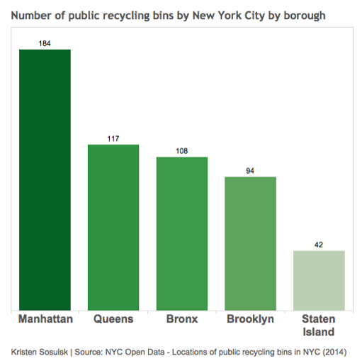
4) Why are there dual encodings for categorical data?
Avoid using different colors or shading within the same bar chart. The label describing the bar should make it clear enough what the bar represents. Alternatively, this is a technique that you can use to highlight one particular bar that you want to draw your audience’s attention towards.
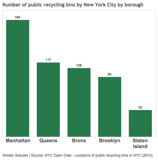
Notice in this revised chart that the displayed lengths and values labeled on top of each bar effectively represents the number of recycling bins per borough, and clearly provides a means of comparison amongst boroughs.
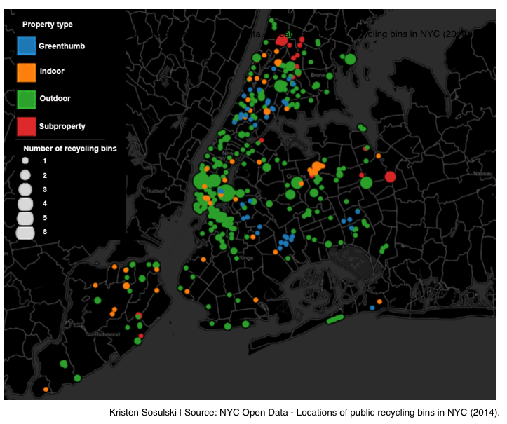
5) What do the colors and the size of the bubbles mean?
Always describe what the colors, lines, bubbles, bubble size, bars, and dots signify in your charts. For example, look at the bubble chart below. Bubble charts are used to display multivariate data. The size of a bubble represents a quantitative value such as population or quantity, while the color usually is a categorical variable such as region. The position of the bubble is the intersection of the x and y coordinates. In the case below, it is the longitude and latitude. This is usually less precise since the bubble sizes often vary.
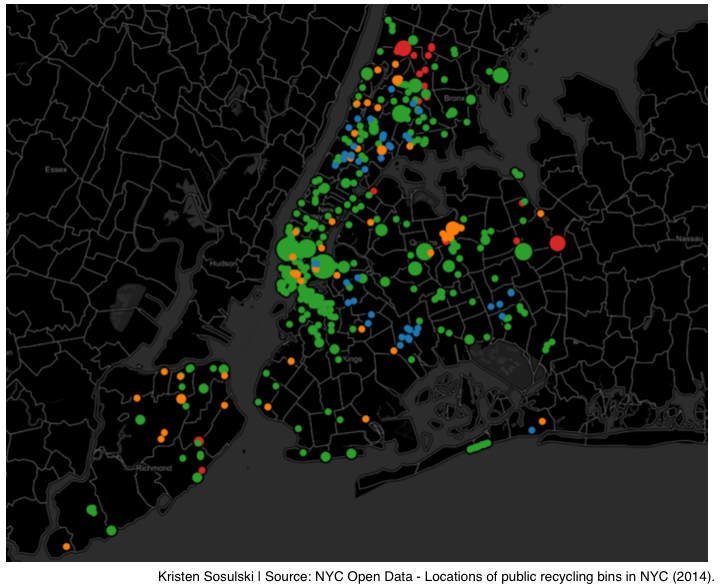
To fix this, include a legend to explain the color codes and sizes of your bubbles.
By checking for these five errors made by data visualization software, you’ll be on your way to creating data visualizations like a pro.
View the SlideShare below:
Are there any other errors that you’ve come across in your data visualization work? Do you have any questions? Leave them as a comment below or ask me on Twitter.
Kristen Sosulski is an Associate Professor of Information Systems and Director of Education for the W.R. Berkley Innovation Lab at NYU Stern School of Business.
[1] Source: Federal Aviation Administration