 To create an interface for our audience to explore our data.
There are strong arguments for why we create data visualizations. In this world of big data, visualizations allow audiences to easily explore and understand our statistics through a visual interface.
Many organizations provide visual interfaces for the public to view, filter, search, and drill down into complex data sets. Users are able to investigate data based on their personal objectives.
For example, the GapMinder Foundation provides an interface to explore the world’s social, economic, and environmental development via GapMinder World. Users can search through this data to answer questions, such as who emits more C02, the U.S. or China? They can use the GapMinder World interface to see a time series view of the information, filter data by country or region, and change variables on the x or y axis.
The New York Times presents an interesting interface based on the American Time Usage Survey that explores How Different Groups Spend Their Day. For example, one could compare the days of unemployed Americans, versus employed Americans. These users can compare groups and their activities over time with this easy to use visual interface.
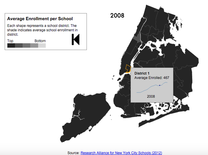
A final example comes from a former NYU Stern student, Riyaz Shaikh. Riyaz took my data visualization course a few years ago, and for his final project, he worked with publicly available data from the New York City Department of Education (DOE), and the U.S. Department of Education provided by the Research Alliance for New York City Schools. He studied the geography of NYC schools, and he created a robust interface to display the average number of school enrollments by year and district. Riyaz also provided an interface to view and explore the time series data of school openings and closings by district. A static image of his work below; click to launch the interface.
These were just three examples of how to use data visualization as a medium for your audience to explore your data to find patterns, relationships, and trends that are meaningful to them.
Kristen Sosulski is an Associate Professor of Information Systems and Director of Education for the W.R. Berkley Innovation Lab at NYU Stern School of Business.