This is the second of three posts that describes an exercise I’ve designed based on the work of Dr. Hans Rosling.
In the first post, I described an exercise where I ask students to interpret the key takeaways from a static visualization borrowed from the Gapminder website.
At the end of the exercise, we conclude that static visualizations are limited in the information that can be conveyed. We examined a static bubble plot, and noted that the bubbles, which represent countries, overlapped one another. This reduces the clarity and accuracy of the data presentation because some countries cannot be identified.

Part 2: Comparing static, animated, and interactive displays
In this exercise, I show students two other presentations of the same visualization. First, students view an animated visualization.
See the video below.
What can you see in this visualization that you could not see in the static display from post 1?
We begin to see how the format of the visualization can change the type of insights that can be presented. With animated visualizations, we can show frames of a static visualization, but we now have the option to change a single variable, such as the year. This allows the viewer to carefully examine the changes of fertility and life expectancy by year from 1800 to 2012.
Interactive visualizations are an alternative to animated displays. Review the interactive visualization interface below. You can click to view the interactive visualization.
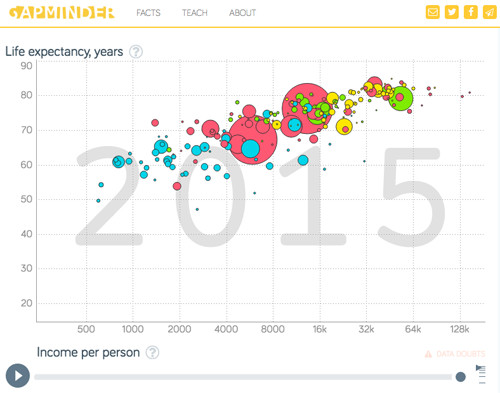
What are the key differences between the animated and interactive visualizations?
You’ll notice the features available that allow the viewer to explore and manipulate the visualization’s variables. For example, countries such as Kenya can be highlighted to provide additional details; this is impossible with static and animated displays. The user is in control of what they want to see and compare with animated displays. It is helpful to provide users with a task to investigate, or if the display encourages data exploration that would be meaningful to them, such as phenomena that’s happening near places they live, or details about something related to their demographic.
In the case of animated visualizations, we need a presenter to help the viewer see key insights, or we need to provide the user with a task to focus their attention. Otherwise, the key insights or noteworthy changes could quickly pass them by. It’s important to keep in mind that even if the takeaway is clear to you, it may not be evident to everyone. Guidance is often needed when presenting charts or graphs. Stay tuned for Part 3 of this exercise, where I will explain and show the power of presentation with animated displays.
Dr. Kristen Sosulski develops innovative practices for higher education as the Director of Learning Sciences for the NYU Stern W.R. Berkley Innovation Labs. She also teaches MBA students and executives data visualization, R programming, and operations management as an Associate Professor at NYU’s Stern School of Business.
Kristen’s passion for technology and learning sciences converges in all facets of her career, inside and outside of the classroom. Follower her on Twitter at @sosulski and learn more at https://kristensosulski.com. Stay connected and join her newsletter.
Great presentation. Thanks for sharing these infographics. Bonnie